Project: Encore Musician experience
Year: 2017
Role: Lead Designer
Boosted musician bookings and reduced churn by leading a full redesign at Encore, the UK’s leading musician marketplace.
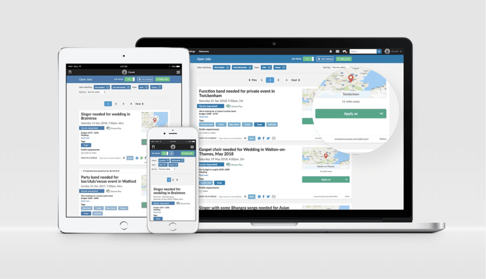
As the sole designer in a small startup team, I redesigned the platform across web and mobile to make gig discovery and application faster and more intuitive. Launched a new brand identity and Encore’s first design system. Results: 38% reduction in time spent browsing gigs and a 26% increase in application conversion.
Scoping & UX Research
I began by mapping the current user journey and running usability tests with musicians to learn what they liked, disliked, and where the experience needed improvement.
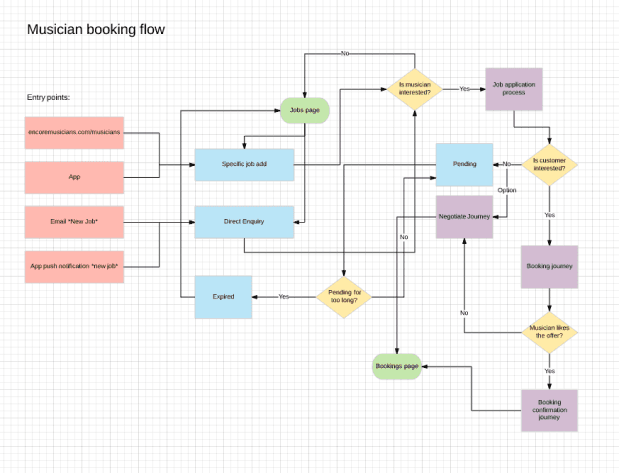
Mapping existing flows
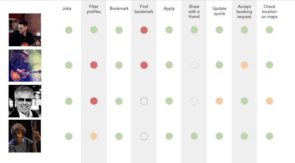
Traffic light usability report
Challenge:
Usability testing showed that applying for jobs was harder than it should be. Musicians struggled to find gigs that matched their availability and skills. The job cards were cluttered, and weak filtering meant they had to spend too much time reviewing each one. The result was a slow, frustrating experience that caused many to give up or apply to fewer gigs.
Internally, there was little agreement on what to change or simplify, which made alignment a key challenge.
My approach:
To understand what information helped musicians decide if a gig was right for them, I ran a simple card-sorting exercise. I wanted to identify which details they prioritised and what could be placed deeper in the flow. At Encore Drinks, our monthly community event, I invited musicians to sort printed job card details by importance.
To keep the team aligned and leverage their user knowledge, I shared the findings and ran an internal Crazy 8s session. This sparked fast ideas rooted in real user insight.
The card sorting showed musicians prioritized event title, fee, date, rough location, start time, and duration. Details like the client message, profile requirements, and exact location were considered later, once they knew the gig was feasible.
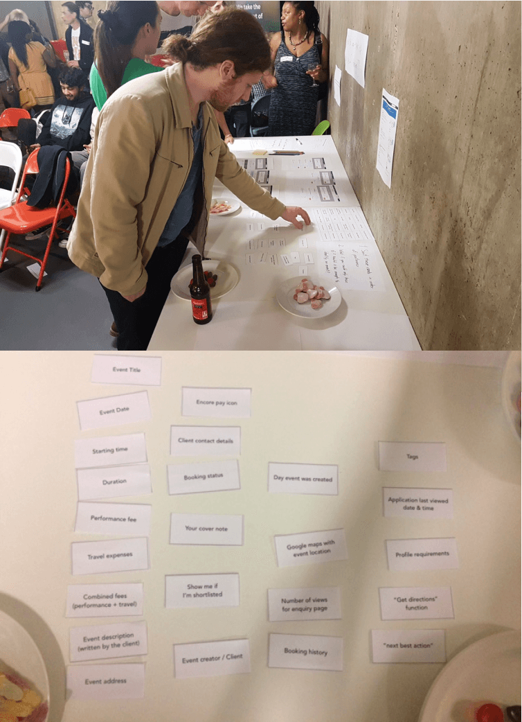
Card sorting with musicians for feature priorisation
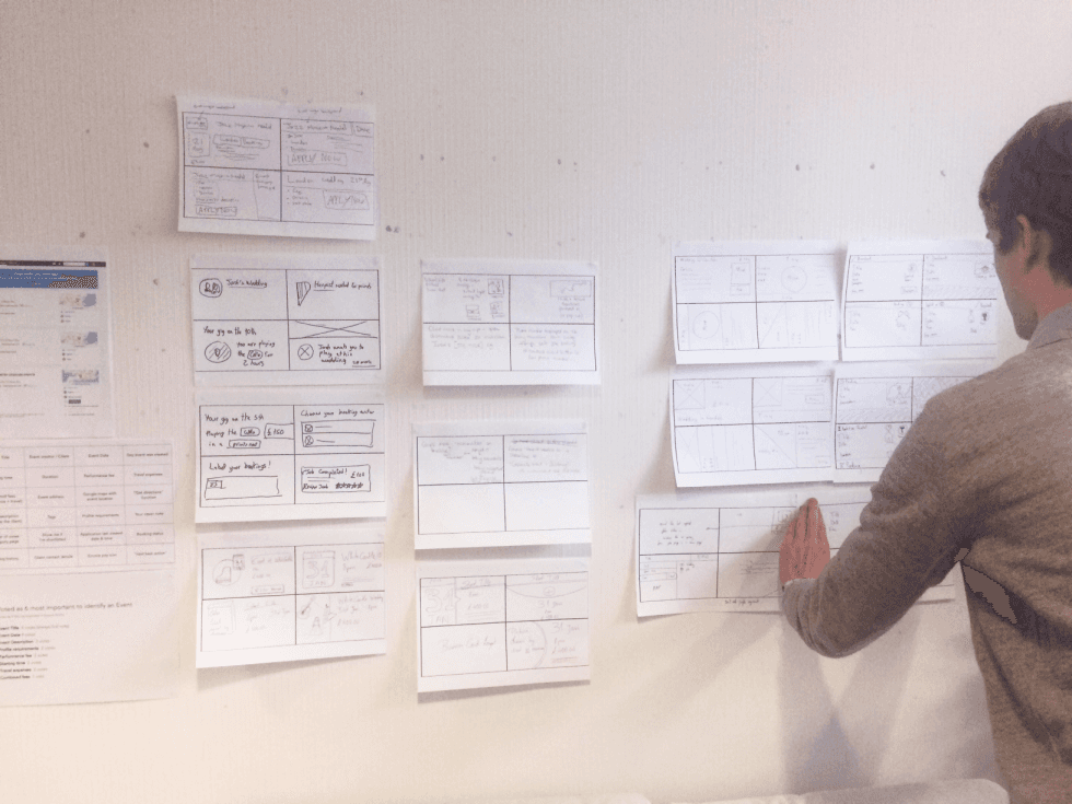
Crazy 8s sketching with the team
In the Crazy 8s session, we explored visual themes for job types. With all events looking the same at a glance, we saw an opportunity to use imagery, color, and icons to make listings clearer, faster to scan, and more engaging.
We moved forward with a three-tiered approach:
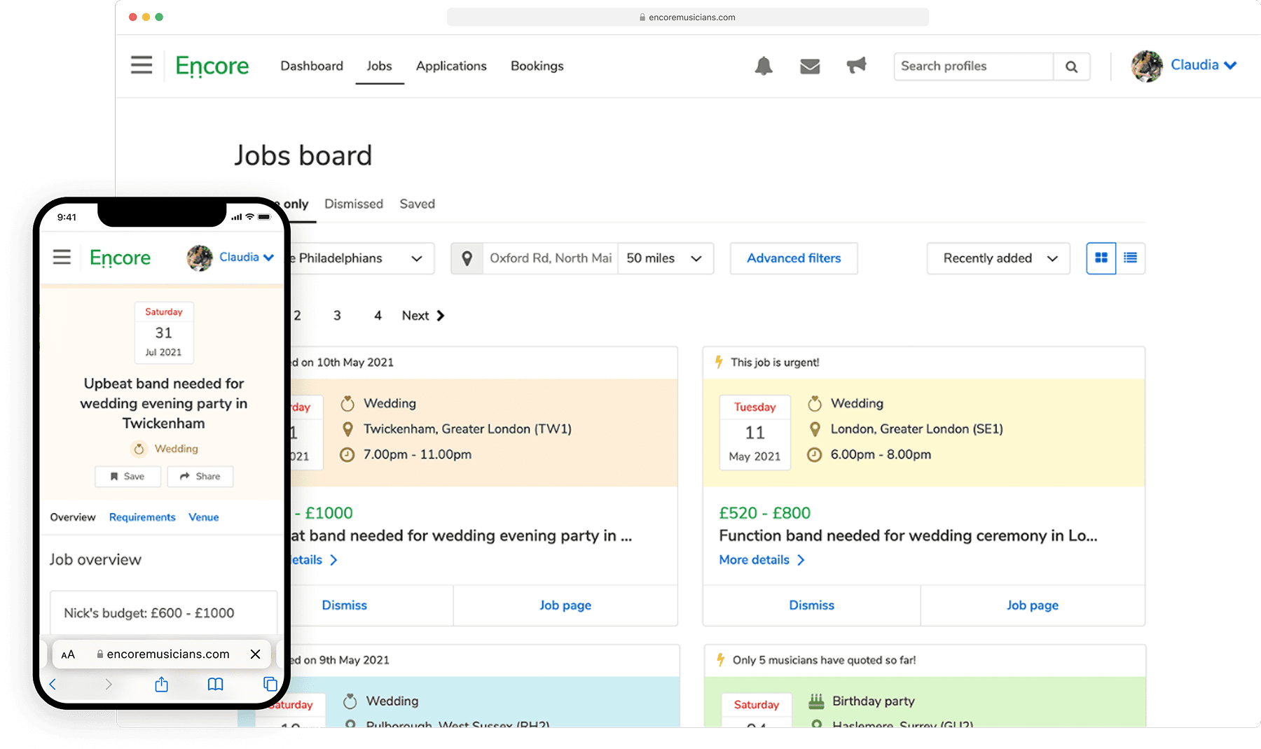
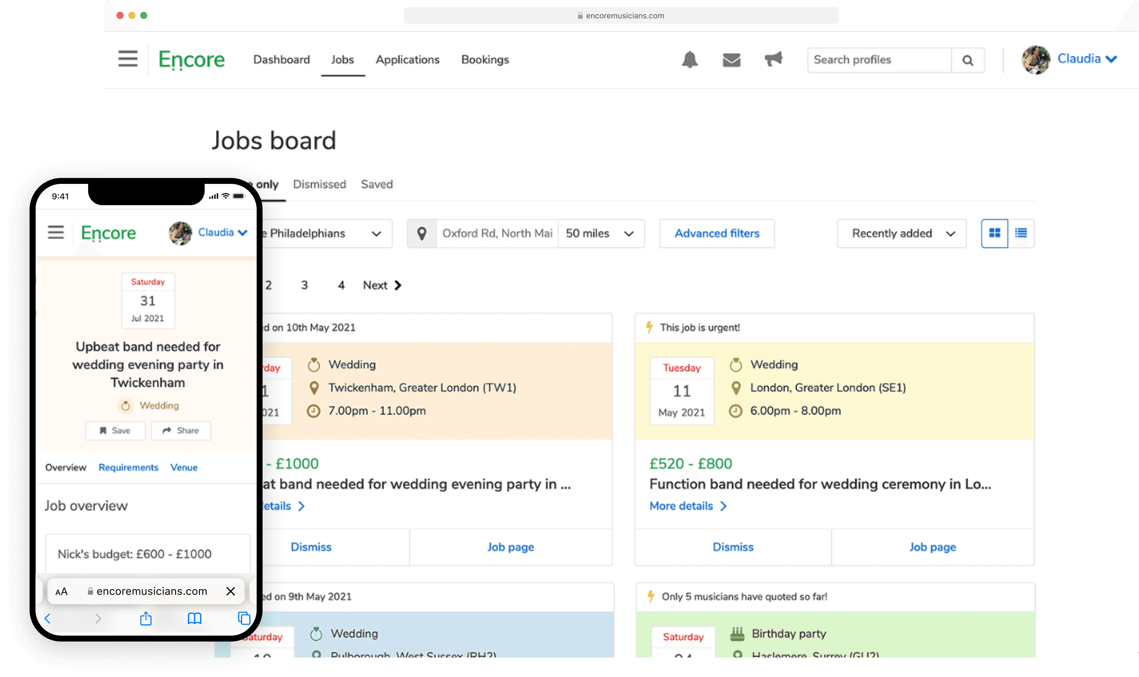
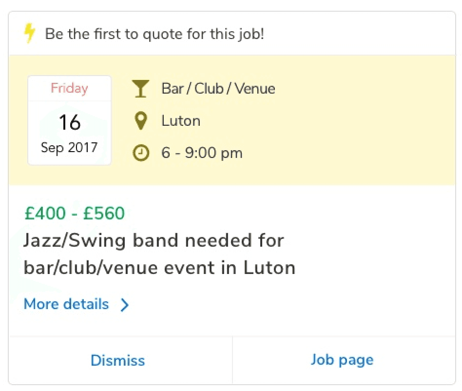
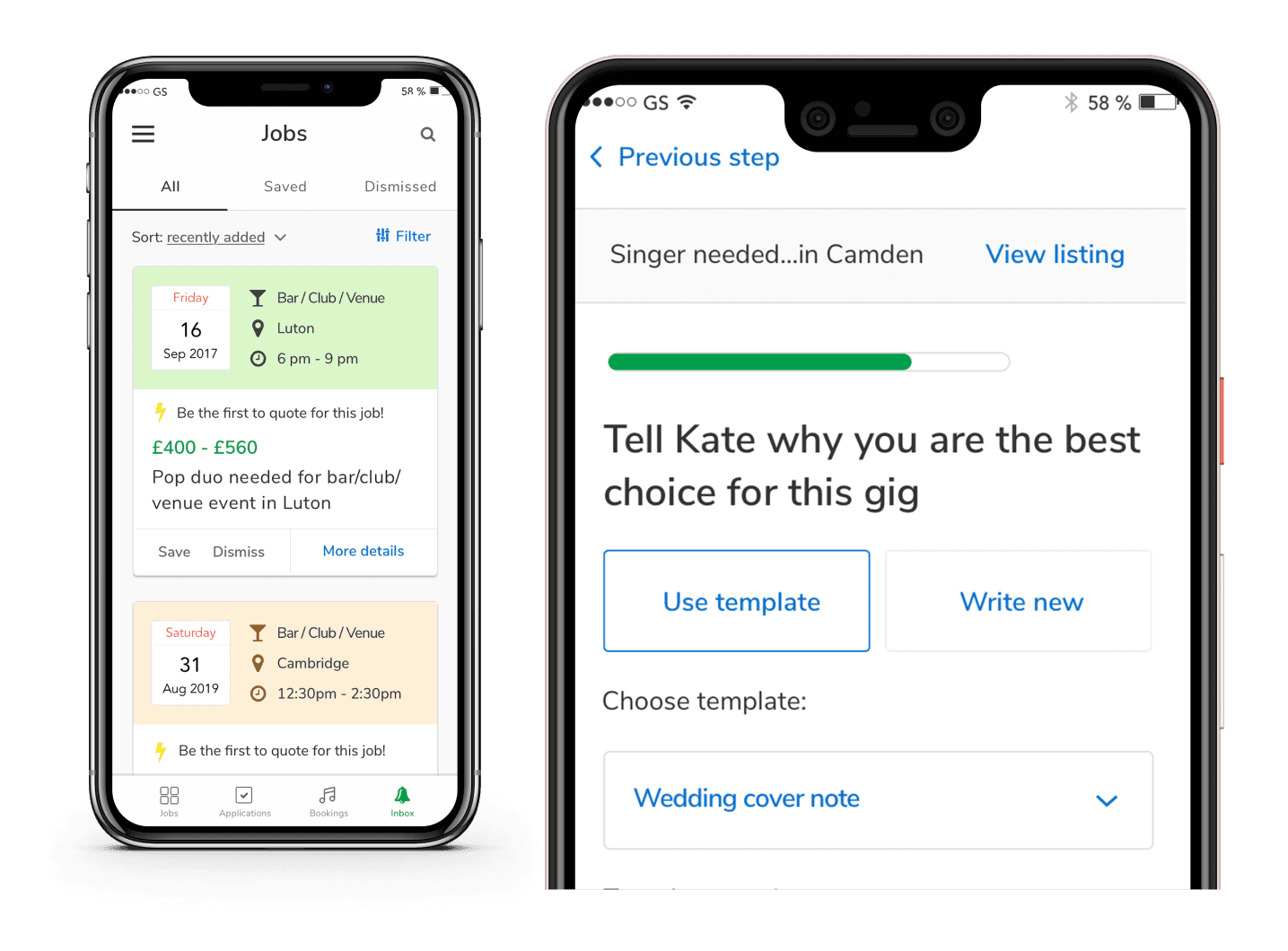
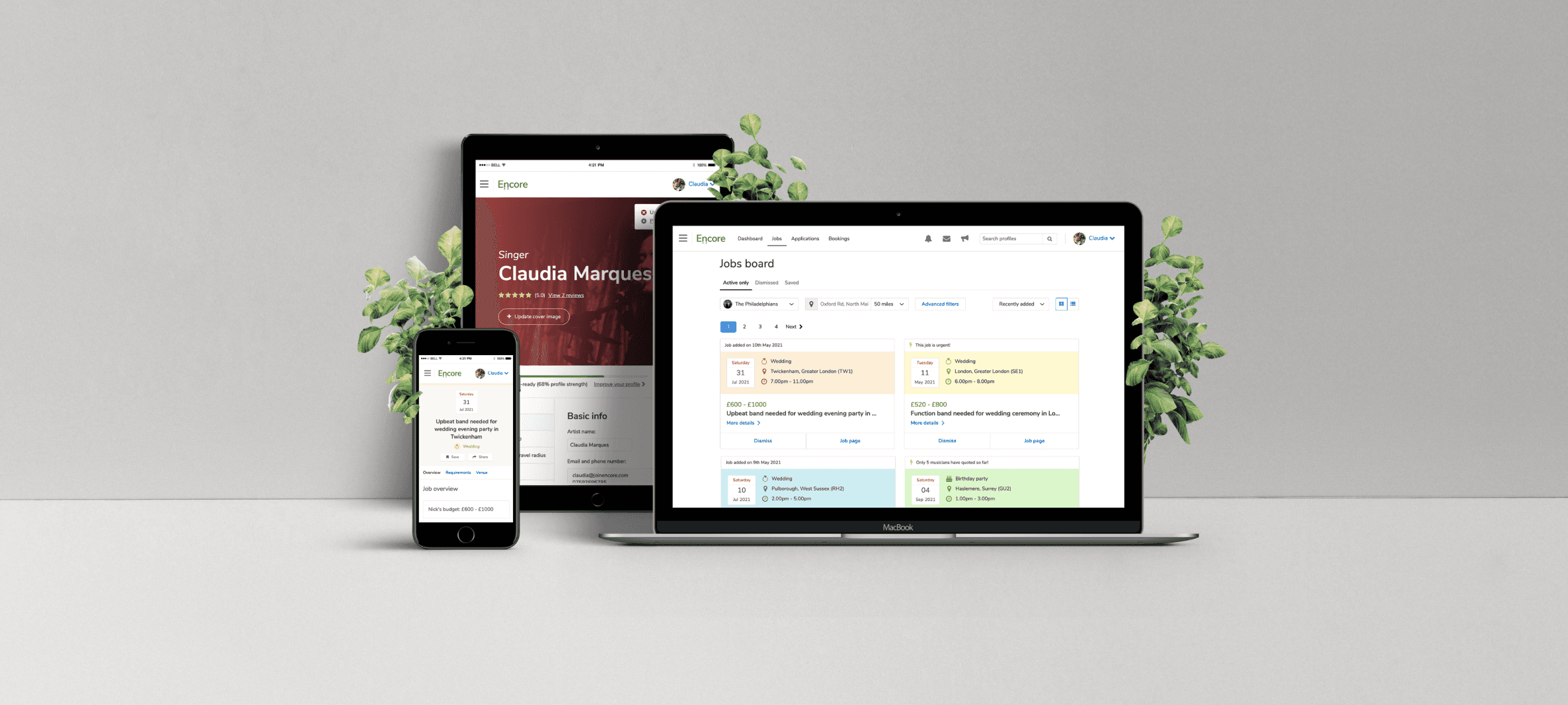
Compact, scannable job cards that display all essential information such as event title, fee, date, time, and location. These cards were designed for quick browsing and easy comparison.
Expandable card view that reveal additional details like the client’s message and specific requirements, without taking the user away from the current page.
A dedicated job details page that brings everything together, including a messaging interface to contact the client. This page can be accessed from both the job board and the musician’s applications dashboard.
Compact job tiles
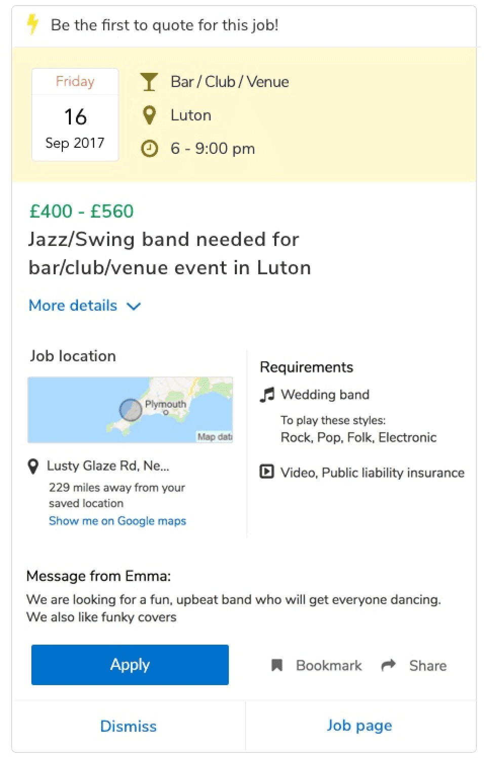
Expandable card view
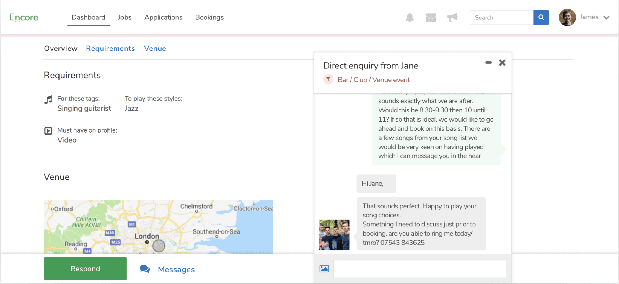
A dedicated job details page
In parallel, I spotted issues in Encore’s brand and UI kit that held back the redesign. Fixing these inconsistencies was key to creating a more cohesive and effective experience.
Challenge:
Encore didn’t have a design system, and with a major redesign underway, it felt like a missed opportunity. The lead engineer and I agreed that building one would streamline delivery and create a strong foundation for future work.
I pitched the idea to the founders, proposing we use this moment to modernize the brand and present a fresh, cohesive experience to musicians. They agreed, but with a tight deadline, I had to balance speed with practicality. I focused on fast, high-impact improvements that could scale.
My approach:
I decided the easiest way to kickstart this would be to focus on concrete, technical issues. Things like accessibility for example: we needed to reconsider our colour palette for contrast as well as things like font sizes and paragraph legibility.
Ultimately, we knew we needed a robust design system to drive change at scale and we needed it fast.
A good example of this fast, pragmatic rebrand was the logo.
I explored free font options with the team and chose Nunito Sans as our new official typeface. Using a heavier weight of Nunito, I updated the existing logo and added the signature note marks beneath the "n" to give it a fresh, modern feel.
Original logo
The new logo
And with this approach, soon we had a design system
It'd take time for it to become as robust as we needed it to but by staying pragmatic and by hosting it on tools like InVision Design System Manager and Storybook we kept things moving speedily and we were laying the foundations for massive speed gains in the long run, not to mention build and design quality.
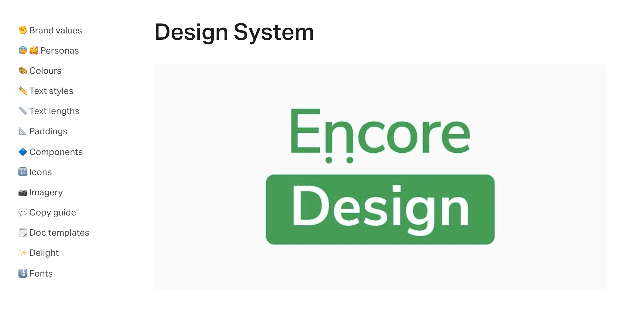
Encore’s new design system, hosted in inVision Design System Manager
Truly understanding our musician users
As we rethought the brand, it became clear we needed deeper insight into our audience to ensure the tone and messaging truly resonated.
Challenge:
Content design had been overlooked, adding to the fragmented experience. With no dedicated content designer or copywriter, we needed clear guidelines to help the team write consistent, thoughtful copy across the platform.
My approach:
Thanks to Encore Drinks, connecting with musicians was easy.
I organised a focus group with our most active users to build a high expectation persona: the kind of musician who most needed and valued our platform. Using that as a foundation, I worked with our musician specialist to shape a new brand tone and copy guide for Encore.
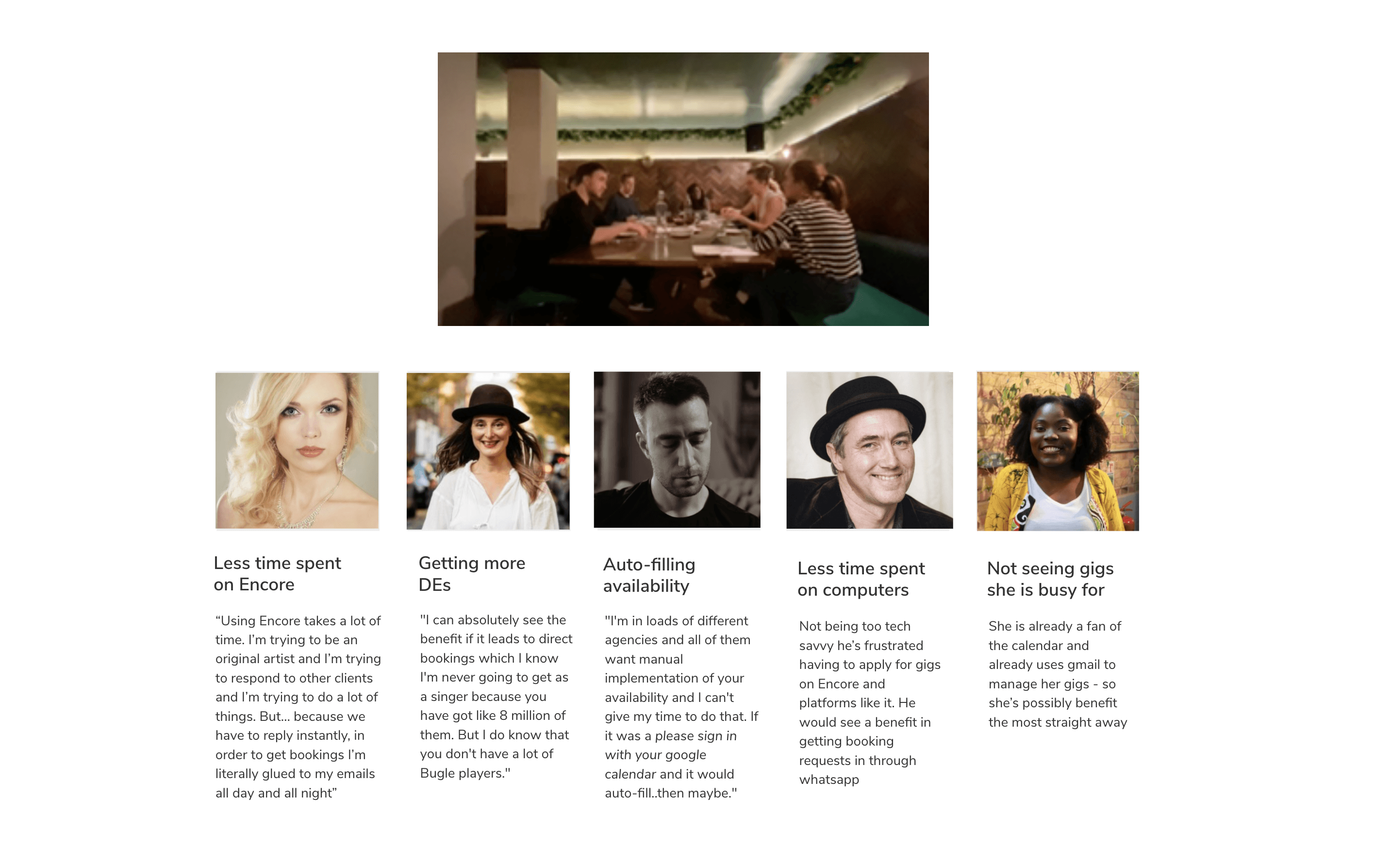
Focus group: talking to our most booked musicians.
"With that persona in mind, collaborated with our musician specialist to develop a new brand tone and copy guide"
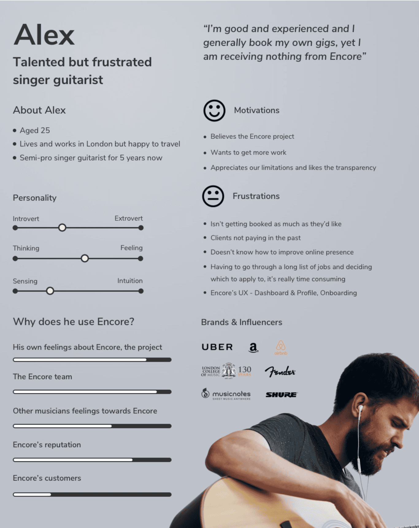
Musician high expectation persona
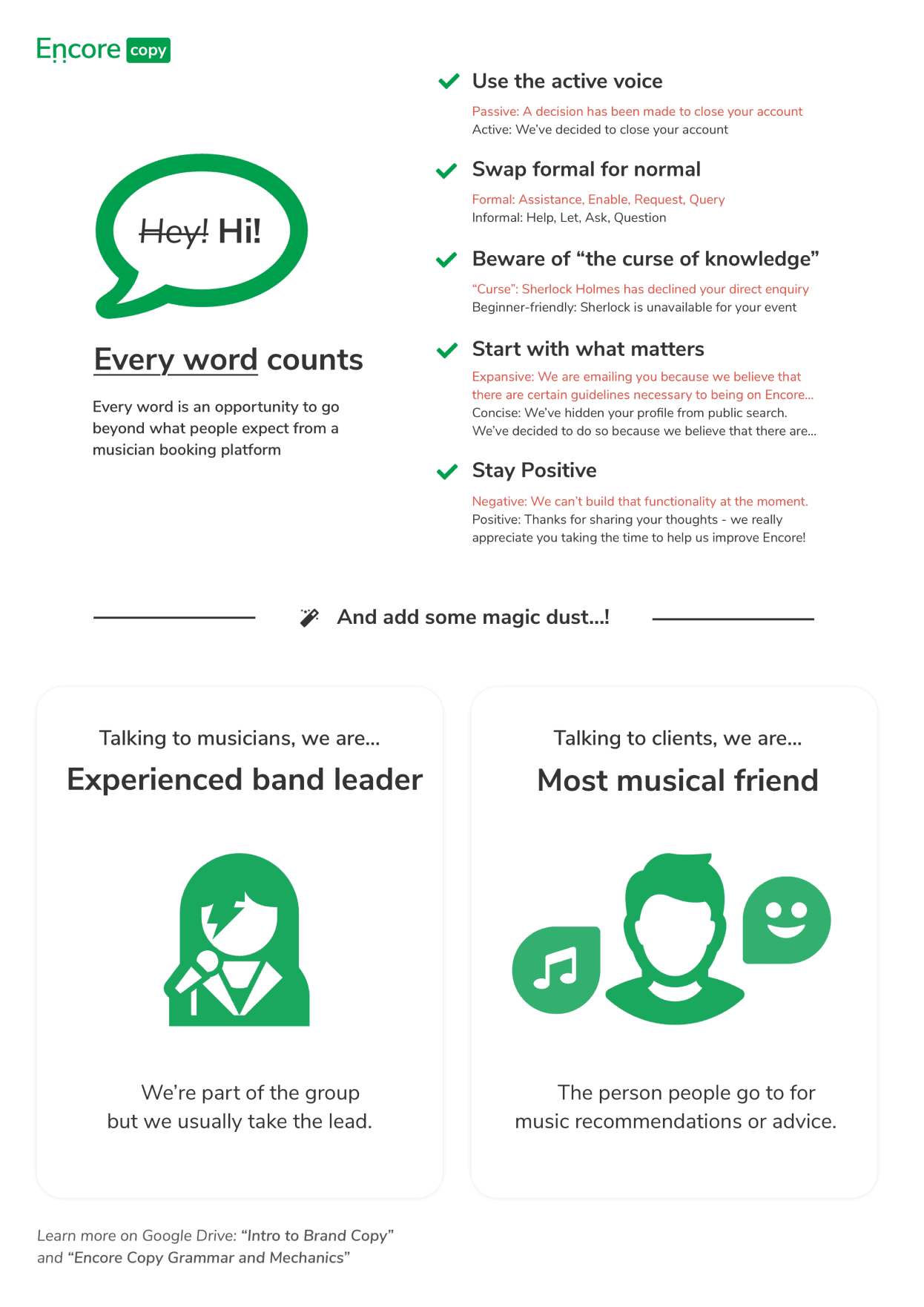
Copy guide poster I put up in the office
Turning vision into reality
All these pieces came together to shape the new responsive experience, guided by insight from the team and users, and enhanced by quick wins from the updated brand and design system.
Speedy, collaborative iteration
At Encore, we used Freehand to share ideas, add comments, and sketch together in real time. I made it a priority to gather quick feedback from across the team, including product, sales, and support, so every design was shaped by a range of perspectives early in the process.
Elevating every interaction
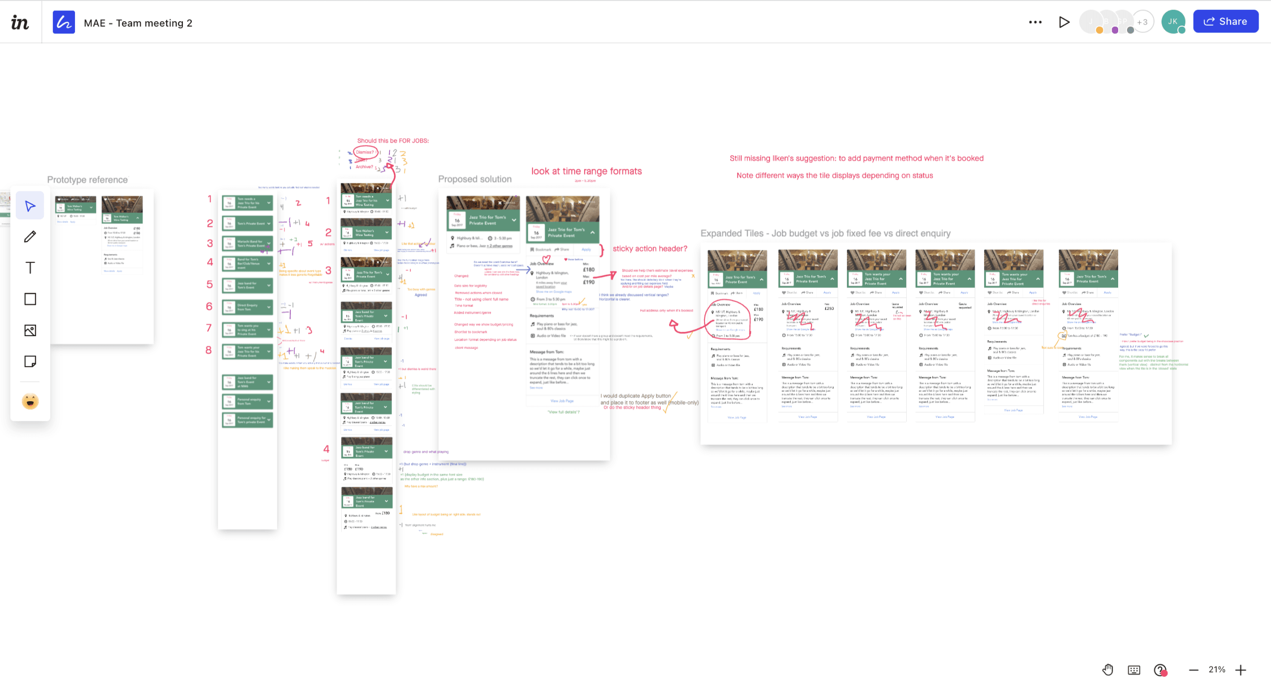
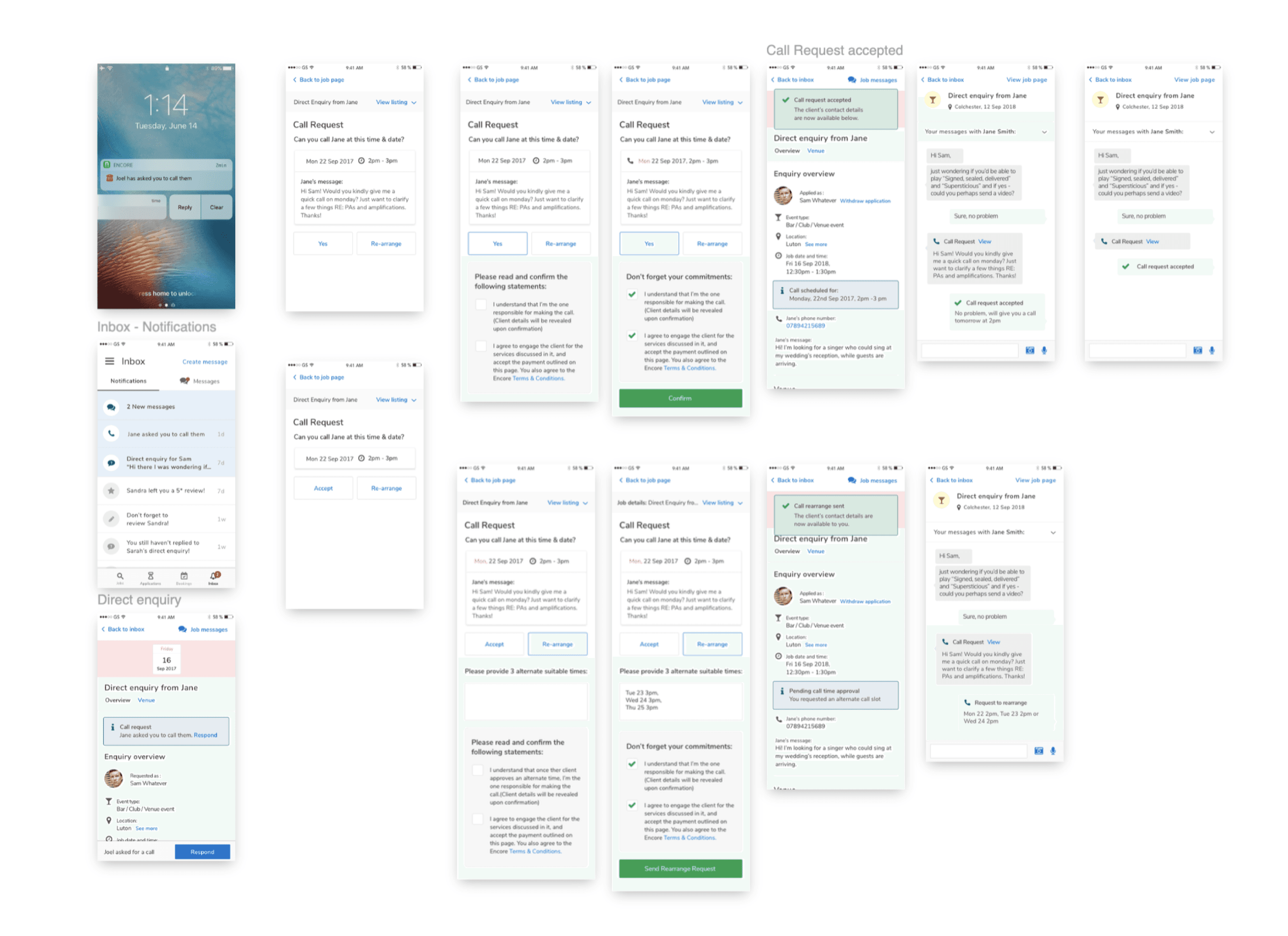
Beyond redesigning the job cards, we needed to rethink all the actions musicians could take from the jobs page. They could apply or withdraw, respond to client requests for messages, calls, or bookings, or save and share a job with a friend.
Through multiple rounds of user testing, we uncovered key issues and carefully refined each interaction to create a smoother and more empowering experience.
Sketch screenshot: the new experience coming to life
Driving real impact
After many iterations and rounds of testing, and working through a few less successful ideas like using imagery in the job cards, we arrived at a solution that delivered real impact and a much stronger experience.
Few metrics: